Align with how people actually think — not how tools are categorized.
Users think in goals, tasks, and situations. The interface starts with natural language input and structures it into meaningful intent dimensions.
Case Study · 2024
Nexa — a search-first web app that helps users clarify intent, reduce cognitive load, and confidently navigate AI tool discovery.
Live · 5M+ monthly visits
When I entered the team, the product had just released its first MVP. My role began with understanding its real-world performance — reviewing analytic data, observing user behaviors, and interviewing early adopters.
Lori Cai · Project Design Intern · Jan – Apr 2024
I · Research Process · 1.1 MVP Critique
My first task was examining how users actually interacted with the MVP across web and mobile. The critique surfaced five categorical issues — none about the catalog itself, all about the gap between user intent and system behavior.
The top navigation exposed too much content — creating noise and making it unclear where users should begin.
The search bar had low usage. Users didn't know what to type, and the system didn't support vague queries.
Filters were generated by popularity — resulting in random, unhelpful options that didn't match how users thought about tasks.
Limited space for showing info, but balancing different user needs was hard. Users had to click into every tool to evaluate it.
On mobile, filters and UI patterns were misaligned with the rest of the system — further hurting clarity and usability.
Reframed as an HMW — "How might we create an intuitive, intent-aware discovery experience that helps users start easily, refine confidently, and evaluate tools with minimal effort?"
1.2 · Understand the Industry
2024 marked a turning point in how people interacted with AI. As large language models became mainstream, users grew more comfortable expressing needs in natural language — but far less comfortable navigating categories, keywords, or technical terminology.
Most users knew what they wanted to achieve, but not what kind of AI tool, GPT, or API could help them do it. Meanwhile, the ecosystem expanded faster than user literacy: thousands of tools, overlapping features, inconsistent naming, and unclear differentiation.
1.3 · Six AI Product Design Principles
Users think in goals, tasks, and situations. The interface starts with natural language input and structures it into meaningful intent dimensions.
The system's interpretation of text is exposed so users can validate and correct it. No black box.
Light-touch refinement steps, recommended categories, and curated results — designed for forward motion, not analysis paralysis.
Handle ambiguity gracefully — ask clarifying questions, offer suggestions, never punish unclear input.
Results aren't just listed — they're framed by the user's intent, so each entry feels like a recommendation, not a search hit.
Layouts and refinement steps follow shared logic even as presentation adapts — same product, different surface.
1.4 · User Scenario Analysis
While defining the value story, I interviewed potential users recruited from Hugging Face and LinkedIn — mainly engineers familiar with evaluating new models. From their stories, the product clearly needed to support multiple entry points, not a single search bar.
Entry · A
"I'm just curious what's out there." The user is browsing, not committing — wants to graze categories, see what's trending, leave with vocabulary they didn't have before.
Needs: discoverability · low-stakes browsing · trending signals
Entry · B
"I have a job to do — find me a tool for it." The user knows the outcome but not the category. Comes with a vague goal, leaves with a shortlist they can act on.
Needs: intent parsing · curated comparison · decision-ready info
Entry · C
"I want a tool that does this exact thing." Already mid-evaluation — comparing against alternatives, sometimes looking for an API or specific capability.
Needs: precise filters · capability search · API-level depth
1.5 · Information Architecture
Principle 02 in action
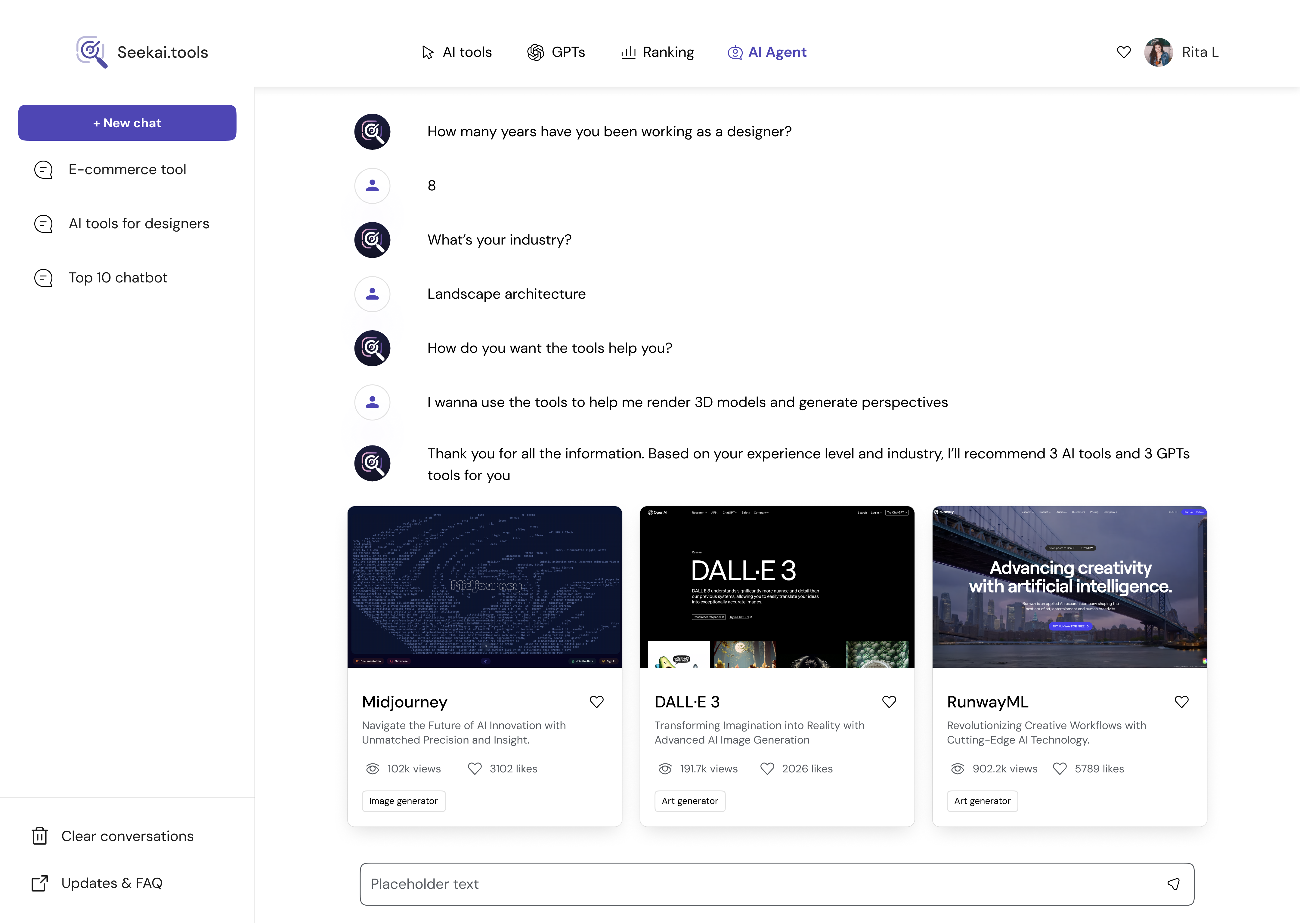
Click a prompt below — Nexa parses your vague intent into structured dimensions you can validate or correct. The interface speaks back.
Live mock — click another prompt to see the system re-parse the intent.
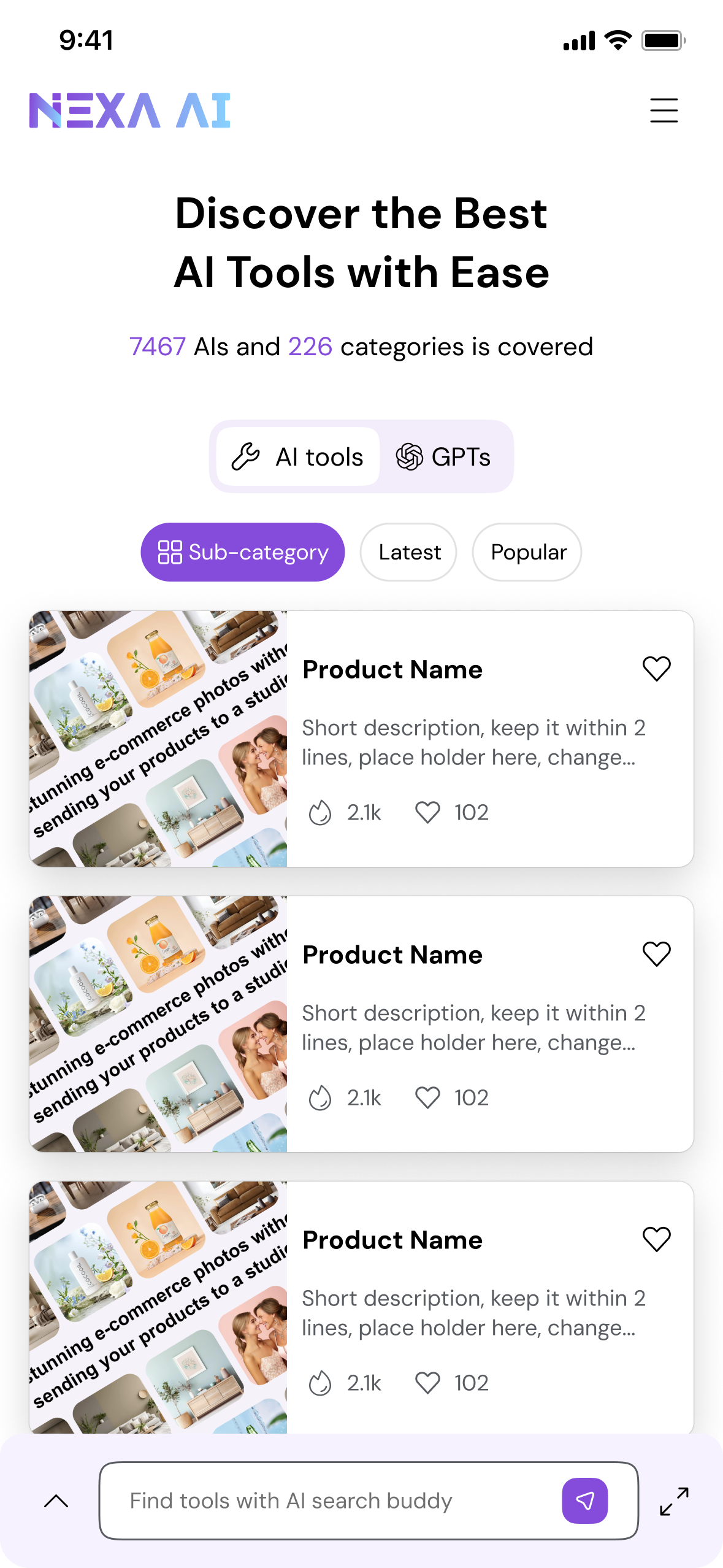
II · Design Iteration · 2.1 Overall Layout & Searching
AI assistance docked beside the result feed.
Conversation flows vertically; results fall beneath the input.
Edge-to-edge launchers — preset prompts as the entry surface.
Inline, hover, and density-first variants — and the one we shipped.
"Visually rich and conversational layouts improved engagement during exploration, but introduced unnecessary cognitive overhead for search-driven tasks — and were intentionally deprioritized in the final design."
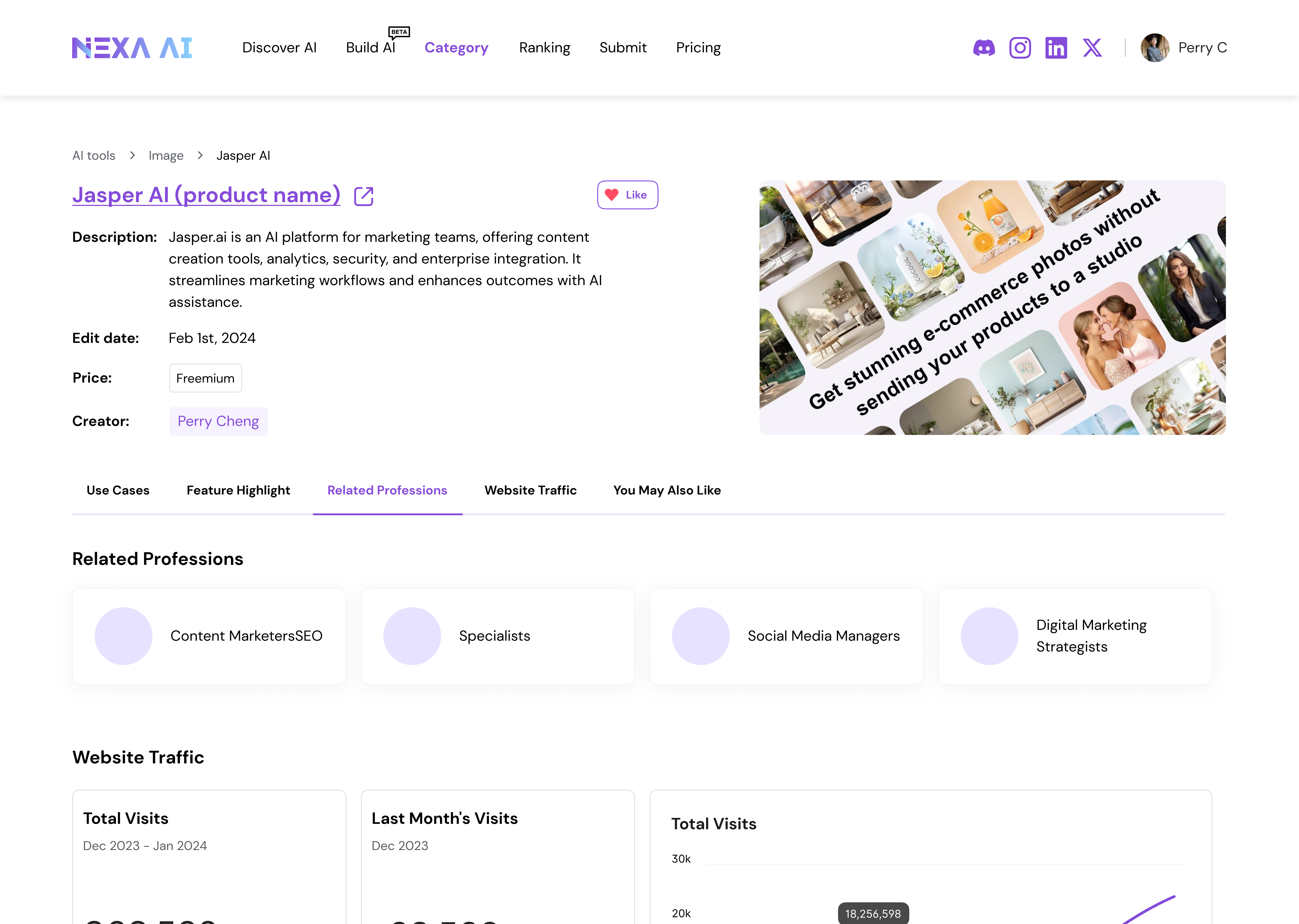
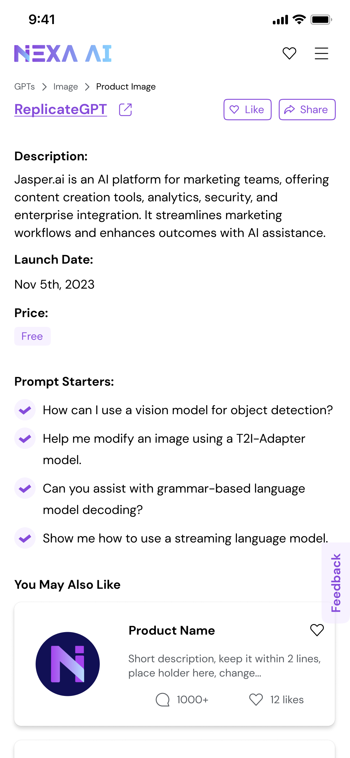
2.2 · Information Card
Once layout was settled, the next question was the atom of the result feed: the card itself. Each direction below makes a different bet about what users need first — visual, action, comparison, or context.
A · Minimal
Lowest visual weight — works at scale, but every comparison demands a click.
B · Discovery
Best for browsing. Visuals carry the meaning, but result density takes a hit.
C · Action-First
Fastest path to "use the tool." Removes everything that isn't the verb.
D · Editorial
Reads like a recommendation. Higher trust, slower scan.
E · Comparison
Surfaces match strength. Great for shortlists; heavy on cognitive load.
F · Use-Case
Frames a tool by the job it's hired for, not by category.
G · Final direction
The shipped card. Holds enough imagery to differentiate at a glance, enough copy to be decision-ready, and enough density to keep the feed scannable.
Shipped2.3 · Final Design
At that point, the core search experience had reached a level of clarity and stability that no longer benefited from incremental UX tuning.
The design challenge expanded — beyond usability, toward long-term platform sustainability and growth. Supporting creators, encouraging contribution, and accommodating advanced usage beyond UI-based tools.
Search experience
Card & result density
Creators · Submissions · APIs
III · Build AI · Build Ecosystem
Each module is anchored by an explicit Why? — the constraint that justified building it, not just the feature itself.
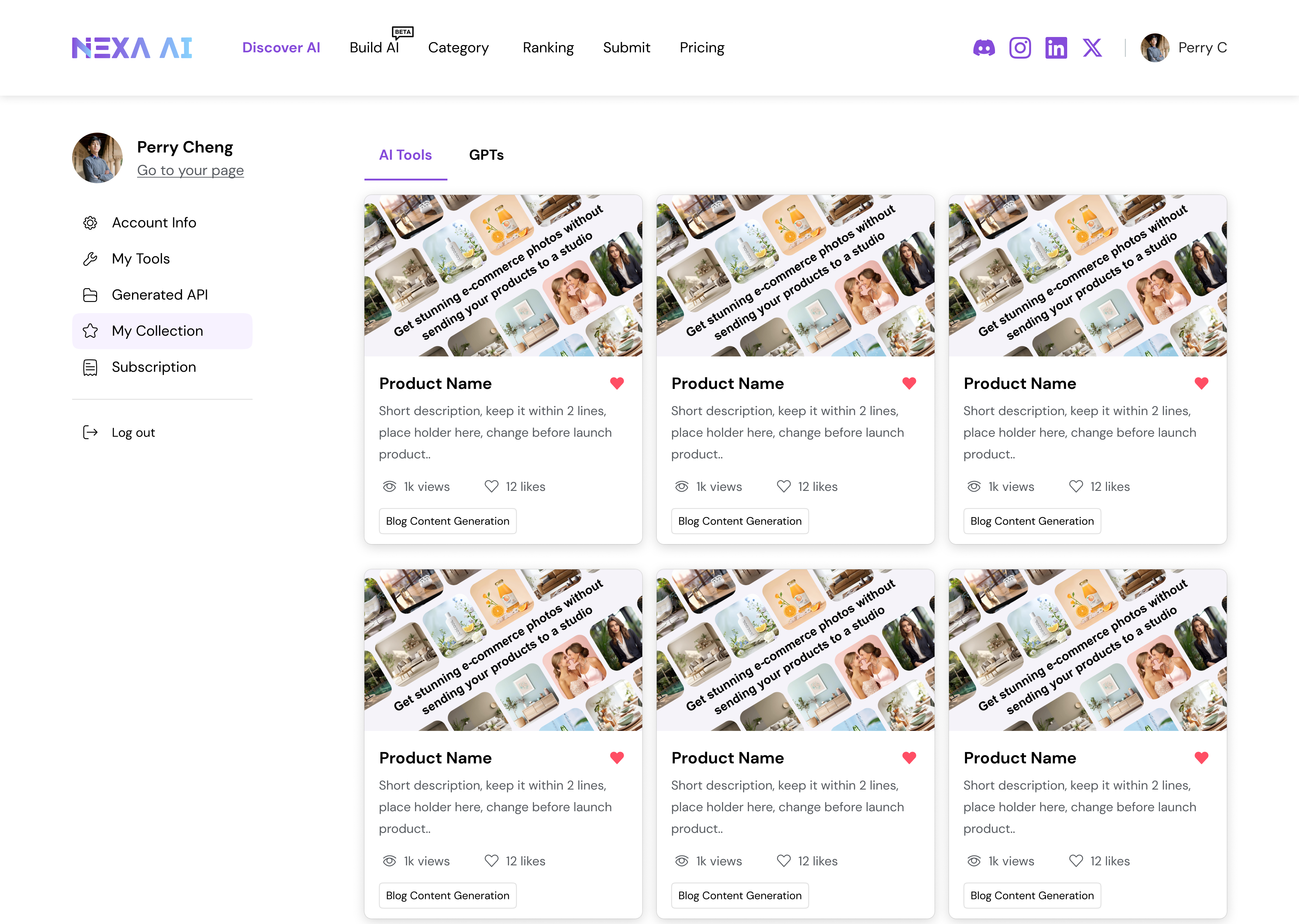
3.1 · Public Profiles
Why? As the platform grows, trust, attribution, and continuity become increasingly important — especially for expert creators contributing tools over time.
3.2 · Submissions
Why? Nexa already aggregated AI tools from open sources, but creators remained disconnected from the platform itself. Without a direct contribution model, tools exist as isolated entries.
3.3 · API Packages
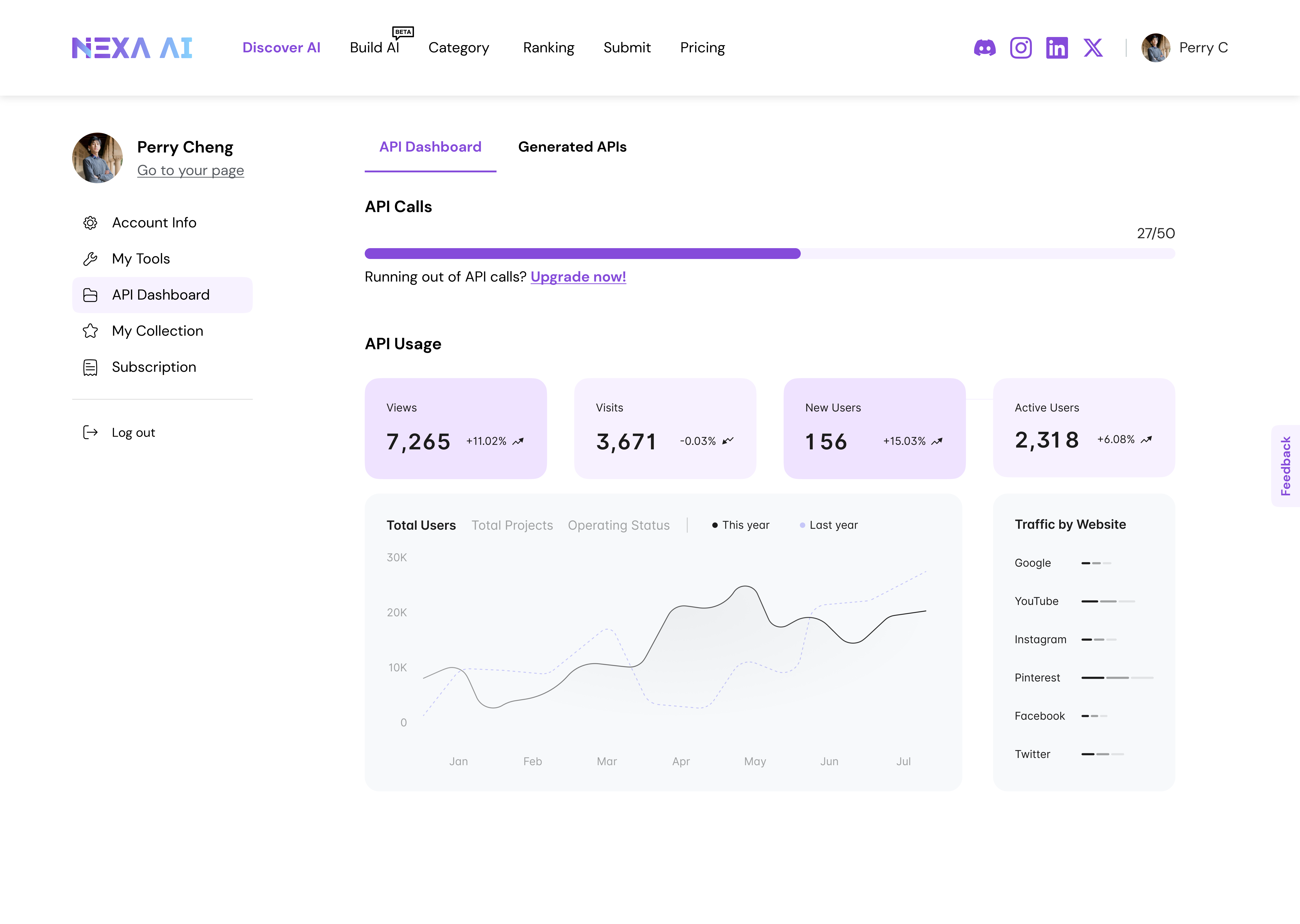
Why? Fully built tools meet most discovery needs — but advanced users often require deeper control, composability, and integration into existing workflows.
Reflection · Results & Impacts
Reach
5M+
Per month
Engagement
3min+
Per visit
Depth
4.2
Pages / visit
From the analysis, over 60% of users accessed via mobile — so we improved mobile-end responsive design as a direct consequence.
Thoughts
One key reflection was recognizing the moment to shift focus. Establishing a search-first foundation clarified user intent and reduced cognitive load — but long-term value depended on enabling identity, contribution, and advanced usage beyond search.
By introducing public creator profiles, creator submissions, and API packages, the platform shifted from passive aggregation toward an ecosystem that connects creators, users, and expert workflows.
If continued, the next phase would focus on validating these platform extensions through creator engagement metrics, API adoption signals, and behavioral indicators of long-term retention — while carefully managing the trade-offs between simplicity, governance, and scalability.